Colour and contrast for graphs

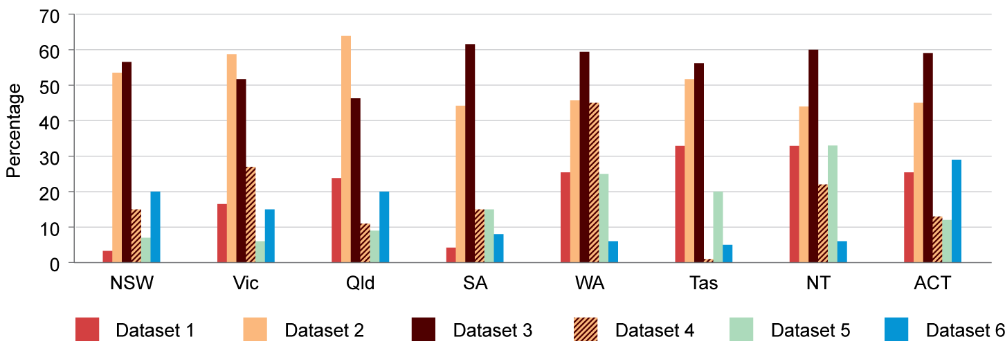
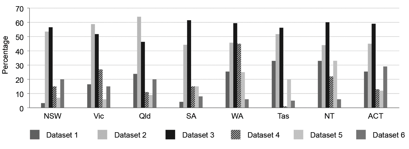
If you use Excel to draw a graph, the default colours the program chooses may not be accessible. For example, there may not be enough contrast between the colour shades, or red and green might be used, which will cause problems for people with red–green colourblindness.

When designing graphs, consider whether the colour choices and formats can be accessed by everyone. In particular, try to:

  • choose an accessible colour palette

  • ensure that there is enough contrast between colours

  • avoid coloured backgrounds that reduce contrast between the figure elements

  • use image editing applications, such as Photoshop and Illustrator, that have colour-checking tools, or test your colour choices using a dedicated piece of software (see Additional resources for graph accessibility)

  • supplement colour coding with symbols, fill patterns, tints or varied stroke types rather than rainbows of colour.

This section covers:


Using symbols as well as colour to distinguish data series

Ensure that the symbols are big enough and different enough from each other to not be confused – for example, do not use octagons and circles:

Do not use symbols if the size of the symbol is meaningful, because it is impossible to accurately compare the area of a triangle (for example) with that of a circle.

Return to top

Using different stroke types to distinguish between lines

Do not use too many line styles in a single graph. If the same style is used more than once, make sure the instances contrast well in tone. Lines may need to be reasonably thick to help readers differentiate them, and should all be of the same apparent thickness:

Use of different stroke type to distinguish between lines

Return to top

Using patterns to resolve issues with similar colour, tone or contrast

Adding patterns can help to differentiate separate categories.

It can be a good idea to test the graph by printing it in greyscale (black and white). This will show whether users with colourblindness will be able to tell the difference between the categories in the graph.

For example, in the colour example, dataset 1 is red and dataset 6 is blue. But in the black-and-white version they are very similar shades of grey; datasets 2 and 5 are also similar. The order of the categories helps make the legend clear in this case, but that might not work in all circumstances:

An example of a graph with up to 6 datasets using varied colours and pattern

A black and white example of the above graph with up to 6 datasets using varied colours and pattern

Return to top

User login

... or purchase now

An individual subscription is only A$60 per year

Group and student discounts may apply

Australian manual of scientific style Start communicating effectively

Purchase