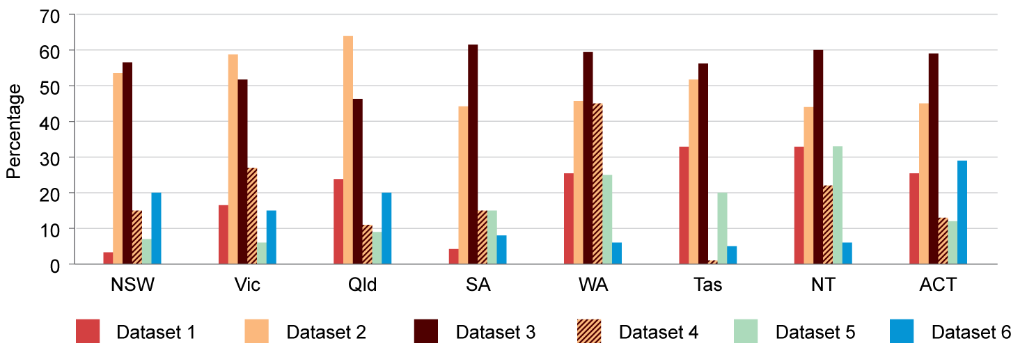
Adding patterns can help to differentiate separate categories.
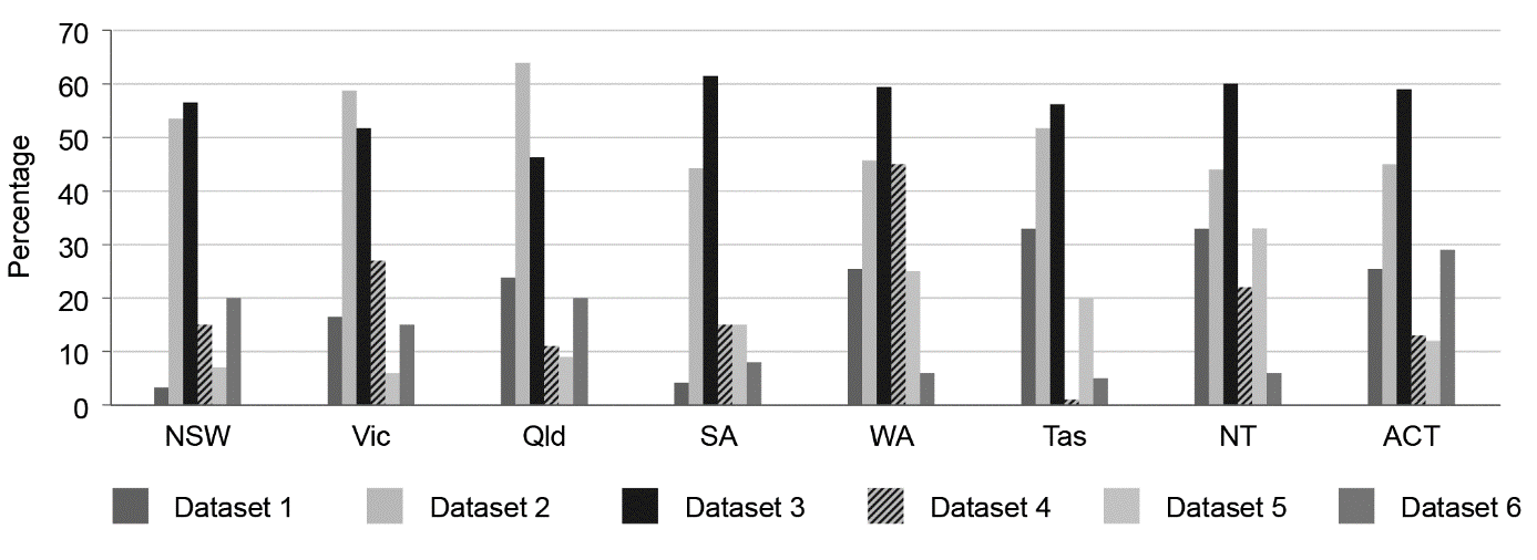
It can be a good idea to test the graph by printing it in greyscale (black and white). This will show whether users with colourblindness will be able to tell the difference between the categories in the graph.
For example, in the colour example, dataset 1 is red and dataset 6 is blue. But in the black-and-white version they are very similar shades of grey; datasets 2 and 5 are also similar. The order of the categories helps make the legend clear in this case, but that might not work in all circumstances: